Adrienne Adam

For the theme of texture, the first photographer I have chosen to look at Adrienne Adam.
I have chosen to look as Adrienne Adam's work because many of his images contain vibrant colours and nature giving the photographs a unique and unpredictable look. Almost all of Adrienne's images are naturalistic which can make them much more interesting to study.
Adrienne's photo is taken at the side of the wave to fill the entire image with one texture. Using an image full of the texture water creates a reflective effect giving a subtle illusion of two textures. The light reflecting off of the water produces distinct lines within it creating a more realistic image. Many colours and tones within the photograph help to make the image even more natural as the tones and colours come from objects underneath and possibly above the water. Adrienne also uses the light in order to enhance the texture captured in the image. The light reflects off of the water making the ripples more defined.
Though the photograph is completely filled water there is a sense of space due to the angle of the image. The angle creates the effect of a wave which in turn creates space within the centre of the image. The most striking part of the photograph is the foreground. This is because in the foreground the colours become more vibrant and the patterns become clearer ad enlarged. Adrienne Adam photographs patterns and textures within nature which allows him to be able to perfectly capture every line and colour possible.


Annotation of edits
Within these photographs I was attempting to capture the water and the sand in their natural states and then compared them in a forced position. Each photo however does contain some source of natural lighting. The work of Adrienne Adam influenced my edits as Adrienne's use of colour and composition is incredibly effective in the way that the pictures look. I feel that the composition of these three images in particular is relatively effective as each one focuses on different areas of sand and water. In order to improve the composition slightly I cropped the second image so that the water and stones completely filled the frame. The colours in all three pictures co-ordinate perfectly together as they tend to be similar colours that vary in shade. In order to make these colours stand out I adjusted the contrast slightly and heightened the brightness to create more control over how much shadow appears in each photo. To improve these images I could aim to add more vibrant colours into the images of water to make the water stand out more amongst the images of sand.


Comparison
|
|
When comparing my work to the work of Adrienne Adam, there a some noticeable similarities but also some differences. While most of Adrienne's images focus on water with the occasional focus of sand whereas my main focus was on sand. Although the focus of the images are different both contain the vibrant colours provided by nature. Though the textures are different the compositions, of these two photographs in particular, are fairly similar as are the depth of field. Another similarity is that both images completely fill the frame and force you to focus on a particular texture.
|


Lucy Shires

The second photographer that I have chosen to analyse is Lucy Shires.
I have chosen to analyse Lucy Shires due to her choice of textures and the vibrant colours within the textures. Her photographs are also very naturalistic which also adds more interest to the images.
A shallow depth of field emphasises the main area of colour and texture. Patterns and textures in the photograph are a mixture of dull and vibrant colours. Lucy Shires uses the natural lighting outside and positions the camera to capture the light reflecting off of the more vibrantly coloured leaves. Capturing the image like this accurately represents how nature is viewed and shows off all of the colours and textures that it provides. What interests me most about the image is the depth of field. It is a shallow depth of field but in the middle ground of the image to capture leaves that at pointing in various directions and are different shapes.
A large amount of space is shown within the image while still filling the frame due to the shallow depth of field. This is because the shallow depth of field creates detail in one area and leaves the rest of the image in block colour with almost no texture. The most striking area of the photograph is at the very back in the background. This is because it is entirely out of focus and though the detail of the leaves cannot be clearly seen the vibrant colours show through perfectly.


Annotation of edits
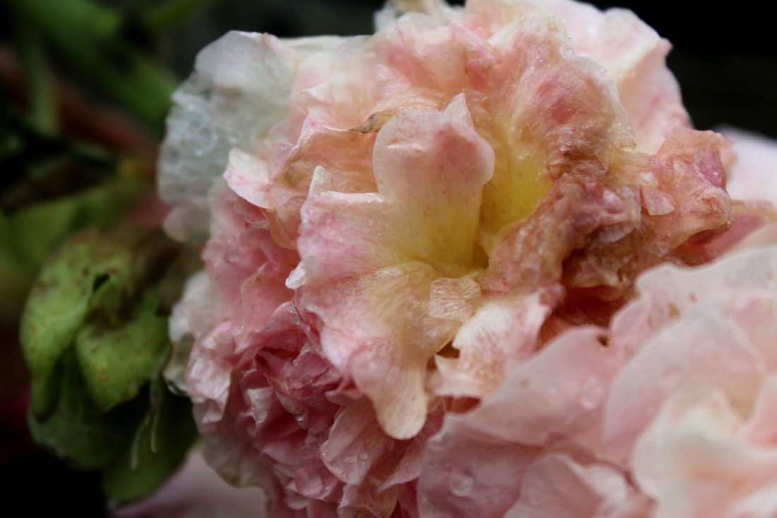
Within these three photographs I was attempting to capture the different textures that various flowers offer while also capturing their vibrant colours. The work of Lucy Shires influenced me to do this as no matter where her depth of field lies and what texture is showing the vibrancy of each object shows through making the patterns visible much more defined and noticeable. The composition of the center image in particular creates an interesting effect as the flower completely fills the frame making the texture more prominent. The colours within each photo contrast each other effectively. Where there is a deep green background there is a flower containing deeper purples and where there is a more vibrant green background there is a more vibrant pink flower. Most of the colours show through due to bright natural lighting with very little editing. Only the first image has been cropped in order to position the flower perfectly. In order to refine these photographs I can pick less vibrant flowers and attempt to make the textures stand out in other ways.


Comparison
|
|
When comparing my work to that of Lucy Shires you can see similarities and differences between our images. Both sets of photos focus on the texture within nature but in different way. A similarity within the photos is the uses of depth of field to capture the texture of the part of nature photographed. There is a difference in that in many of my images fill most of the picture with texture whereas Lucy Shire leaves large areas of background in view as well drawing focus to the texture in a different way than I have. Both have used the element of water in order to add another texture to those that are already present.
|


Edward weston
The final photographer that I have chosen to research for my topic texture is Edward Weston.
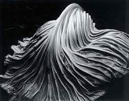
The image I have chosen to analyse is called cabbage leaf. The photograph is of one cabbage leaf and is completely black and white. The use of monochrome is something which I have seen many times and affects Edward Weston's images as it creates shadows over certain areas creating depth and allows the detail of the cabbage leaf to become more prominent.
Light within the image is mainly focused onto the top of the cabbage leaf which creates a main focus point starting from the top an leading the eyes to the bottom of the image in the direction in which the lines flow. The image is black and white so none of the colours show through, however making the photograph black and white allows the shadowed areas to have more effect on the cabbage leaf and makes the veins stand out more. Using a cabbage leaf gives a variety of unpredictable patterns as each leaf will always be different. What interests me most about Edward's work is that because of the angle of the lighting the focus object is never darker then the background at any point.
A large amount of space is displayed in the photograph but only around the edges as the cabbage leaf has been placed in the center, bringing all of the focus onto the leaf. The part of the photograph that interests me the most is the very top of the image and the way the light is focused down the center of the leaf. Edward Weston was able to capture the patterns of the cabbage leaf as he focused mainly on highly detailed images. This means that his texture photography is clear and highly effective.
Positioning the leaf in the center of the photograph works well as it allows the leaf to become the main focus while still allowing a background and other areas of focus. Others observing the image may become confused and question the use of a cabbage leaf as it is a unique object to photograph. From exploring Edward Weston's I have learnt that a black and white image can have the same, if not more effect then a fully coloured image.


Annotations of edits
Within these photographs I was attempting to capture the details and patterns on each object to capture various textures using a range of different lighting. The work of Edward Weston inspired the use of the monochrome in my edits to make the texture stand out. His composition and the use of a darker back ground is also what inspired me. I feel that the composition of many of his pictures helps to keep the focus on the texture within the images while also clearly presenting the background. Within these edits there are no colours so instead it is the multiple shades of grey and black which create the contrast. The areas of light grey contrast well with the pitch black background.


Comparison
|
|
My images are in monochrome as are Edward Weston's. My images however contain various different textures from many objects whereas most of Edward Weston's focus on the textures of food. Depth of field is also a difference in our images as the depth of field in my photographs vary whereas Edward Weston uses the same depth of field in most of his photos. Angles are also a difference between my work and Weston's as most of his angles are the same giving the same effects of texture whereas my angles differ giving different perspectives of the same texture.
|


Own response


My own response was to chose a particular texture, in this case different elements such as wood, water and fire, and to focus only on those textures but using other simpler textures to enhance the texture of the wood, water and fire and to give it character. Throughout my photo-shoot i have begun refining my work and selecting better and more interesting ways to present texture. I have used the natural lighting to my advantage in order to create a dark contrast behind the lighter areas of work. The composition has been adapted depending on the kind of wood photographed and what shapes there are within the wood and so that the way the water and fire is moving is also captured.
final outcomes
I have chosen these twelve images to present as I feel that these best represent different compositions and depths of field. They also show a main texture with other subtle textures involved in order to enhance the main one. The textures of wood in particular show good contrast between the light and dark areas of the monochrome pictures.


